 |
I'm not a big fan of striped petunias, but these were such a perfect color match to theflorescent pink geraniums that I couldn't resist them. Neither could the damselfly! |
Showing posts with label color. Show all posts
Showing posts with label color. Show all posts
Wednesday, July 29, 2015
Wordless Wednesday 7.29.2015
Wednesday, July 22, 2015
More Showers = More Flowers
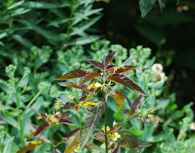
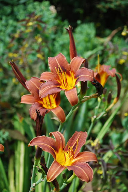
One upside of the cool and rainy summer we've been having is the reappearance in my garden of a planting combo that I haven't seen blooming together for many years; 'Milk Chocolate' Daylily and 'Firecracker' loosestrife.
 |
| Lysimachia ciliata 'Firecracker' |
 |
| Hemerocallis 'Milk Chocolate' |
 |
| the buff colored seed heads of blue oat grass, left, and the tawny brown seed capsules of beauty bush, right back, add more echoes to the various brown hues |
Wednesday, November 12, 2014
Wednesday, April 30, 2014
Wednesday, February 05, 2014
Tuesday, February 04, 2014
Design Decoded 2.04.2014
In a word: Simplicity.
- The simple mass planting of one flower species creates a restful, yet intriguing, color-play of closely related hues reminiscent of the color field paintings of Mark Rothko.
- And they're edible! Any trailing trailing plant, but particularly annuals with a long flowering period and multi-colored blooms, would be suitable. Think Calibrachoa, Verbena, Petunia, etc.
- The simple, bookshelf-style frame is extremely well crafted, but is designed without frills to serve as a background to the planting.
- The deep shelving permits the use of common flower pots rather than specialty inserts, as with some of the new-fangled vertical gardening systems.
The downside? This baby would be extremely heavy, especially with wet soil.
A vertical garden can be a practical space saver and a work of art. Are you ready to include one in your landscape?
Monday, October 21, 2013
Garden Designers' Roundtable: Principles of Design
The "principles of design" as applied to the landscape may mean different things to different people (behold the power of the Roundtable!); my take on this topic is informed by my professional training which was based on a fine arts perspective. The artist's approach incorporates a vocabulary of elements and principles to be used as the building blocks for any type of design — landscape or otherwise. Mastering these concepts is on-going, but they do provide an excellent rubric for both creativity and analysis/critique.
The elements of design: line, direction, shape, form, size, texture, value and color. They're the features that are most typically referred to when landscapes and gardens are discussed. The principles of design are a bit more abstract, and consist of: repetition, pattern, harmony, gradation (which I wrote about here), contrast, dominance, unity, and balance.
For this discussion, I'll focus on contrast, because I think it's the most powerful and important principle as regards landscape design. Why? Most landscapes are comprised primarily of plants (repetition) and are, therefore, very harmonious (lots of similar items). By placing plant materials with strongly contrasting characteristics next to one another, you bring their differences to the fore and strengthen them as individuals. The plant "characteristics" that I refer to are the elements of design that they present. Here are a few examples:
This simple planting of yucca and nasturtium is visually arresting because of the strong contrast in foliage texture (size and shape) and plant form (upright and rounded vs. low and horizontal).
The high contrast in flower colors (yellow and purple are opposites on the color wheel) in this photo helps the eye distinguish between similar plant/flower forms.
Contrast in foliage textures and colors are crucial to a garden's success.
In a mass planting like this monochromatic perennial garden, contrast in flower value, form, and size, as well as plant form and size, and foliage texture, make for a visual delight rather than a boring mess.
The principle of contrasting elements should be applied to landscapes of any scale and design style, and should be applied to hardscape components as well. I hope you'll join my fellow members of The Garden Designers' Roundtable for more insights into the principles of design:
The elements of design: line, direction, shape, form, size, texture, value and color. They're the features that are most typically referred to when landscapes and gardens are discussed. The principles of design are a bit more abstract, and consist of: repetition, pattern, harmony, gradation (which I wrote about here), contrast, dominance, unity, and balance.
For this discussion, I'll focus on contrast, because I think it's the most powerful and important principle as regards landscape design. Why? Most landscapes are comprised primarily of plants (repetition) and are, therefore, very harmonious (lots of similar items). By placing plant materials with strongly contrasting characteristics next to one another, you bring their differences to the fore and strengthen them as individuals. The plant "characteristics" that I refer to are the elements of design that they present. Here are a few examples:
This simple planting of yucca and nasturtium is visually arresting because of the strong contrast in foliage texture (size and shape) and plant form (upright and rounded vs. low and horizontal).
The high contrast in flower colors (yellow and purple are opposites on the color wheel) in this photo helps the eye distinguish between similar plant/flower forms.
 |
| Design by Denver Botanic Gardens |
 |
| Canna and kale design by Denver Parks and Recreation |
In a mass planting like this monochromatic perennial garden, contrast in flower value, form, and size, as well as plant form and size, and foliage texture, make for a visual delight rather than a boring mess.
 |
| Design by Denver Botanic Gardens |
Monday, August 26, 2013
Garden Designers' Roundtable: Bold
 |
| Canna spp. |
I hear you.
Use your voice to create something powerful and beautiful — not just noise. Create bold notes in the landscape to develop focal points that can lead the eye through the space and unify it, too.
Two simple ideas to employ when you want to be bold: big and bright.
A big object is a bold presence that demands our attention, whether it's the overall plant size (relative to it's surroundings), flowers, foliage, or an in-organic item that's been introduced to the landscape:
 |
| Hibiscus spp. |
 |
| plume grass, Erianthus ravennae |
 |
| giant silver mullein, Verbascum bombyciferum |
 |
| an eight foot tall bronze sculpture by Kevin Robb |
A bright object catches the eye and is easy to see in a world of green. Think red, yellow, and white — the colors most easily discerned by the human eye, even in low light:
 |
| Bold red tulips in Spring demand that we "Wake up, already!" and leave Winter blah behind. |
 |
| Acid yellow flowers and foliage is are not to be ignored. Design by DBG. |
 |
| white glows even on a cloudy day |
 |
| This brilliant blue hue, unusual in nature, demands our attention. Design by Carol Hines. |
 |
| purple smoke tree, Cotinus coggygria and Achillea at Denver Botanic Gardens |
 |
| Canna and kale |
 |
| Hesperalo parviflora. at Kendrick Lakes. Design by Greg Foreman |
 |
| Cranbe cordifolia |
 |
| holiday light extravaganza at Denver Botanic Gardens |
Dare to be bold — you may find a voice that you never knew you had.
For more inspiration on the bold landscape, click through the links below:
Garden Designers' Roundtable
Wednesday, August 21, 2013
Wordless Wednesday 8.21.2013
Wednesday, February 13, 2013
Monday, October 29, 2012
Super Red
You can keep your burning bush pink and your orangey-red Autumn Blaze maple (the "it" tree for fall color around here these days); I'll take the dark, luxurious reds of fragrant sumac, Rhus aromatica, any time.
The glossy foliage catches the low autumn light and adds depth and complexity — plus a touch of glamour — to this Rocky Mountain native.
Hands down, the best shrub for full sun, poor soils, and dry conditions when your goal is super red fall foliage.
The glossy foliage catches the low autumn light and adds depth and complexity — plus a touch of glamour — to this Rocky Mountain native.
Hands down, the best shrub for full sun, poor soils, and dry conditions when your goal is super red fall foliage.
Monday, July 23, 2012
Garden Designers' Roundtable: Art + Garden
Art may be the ultimate focal point in the garden. Unlike plants, which are ephemeral throughout the seasons, art can be used as a permanent statement to express one's personal identity or enforce a sense of place. The garden itself can be used to set the stage for the artwork and provide the backdrop, frame, and foreground. Here are a few examples of art in the landscape, and why they work so well.
Representational artwork may best represent / reenforce a specific place. Nothing is left to the imagination; the association between object and place is clear, and the artwork contributes additional information about the space to the viewer.
This life size bear trio looms over the entry court of a private residence in Vail, Colorado. They look like they've just emerged from their woodland home. Notice how the white trunks of the aspen trees create a nice contrast with the dark patina of the bronze. The colorful flowers at the base of the sculpture catch the eye (as if the bears aren't enough!) and bring them into scale. The large size and prominent location make this a major focal point for this home.
A Japanese quince (Chaenomales japonica) paired with a Japanese lantern reinforces the identity of the Japanese Garden at the Royal Botanical Gardens, Kew. Again, a bright flower companion may initially catch the eye, but the dark, evergreen background in contrast to the pale stone sculpture is key.
This statue does not reinforce its urban Denver location but is, instead, a memento or symbol of a specific time or place that's important to the owner. This small piece is part of a vignette within a garden — a treasure to be discovered. Here, the gardener has used a Japanese maple (Acer palmatum) with dark foliage as a contrast and color echo to the clay. I also like the way that the water's reflection has been used to magnify the presence of this little piece.
Abstract artwork may be viewed as the self-expression of the owner. It represents an emotion or a memory — perhaps related to a specific person, place or time — that's meaningful to the owner.
This joyful sculpture of stainless steel by Denver artist Kevin Robb, is reaching up to the clear, blue sky. It's hard, shiny, geometric form is wonderfully contrasted by the organic, undulating forms (lavender? rosemary?) beneath it. Perfection is the color echo of matte gray foliage to the steel.
Another whimsical art piece is this sculptural gate by Denverite Dennis West. The lively, nature-based forms bring a hard, impersonal entryway to life.
Sinuous curves feature in the simple, repetitive design of this sculpture (perhaps originally part of an architectural detail), which is the perfect focal point of a small meditation garden. Note how the fine textures and limited selection of the companion plants create a calm and relaxed setting.
Last, but not least . . . my favorite art piece in my garden is this tile mosaic that hangs on our patio wall, adjacent to the place that inspired it. It was made by our daughter when she was 10 or 11 years old (sadly, it's not dated) and is simple titled "Pond." Erin went on to earn a degree in apparel design and production from Colorado State University and became a talented textile designer. She recently opened her own business and is the proud owner of Super Good Art Stuff in the Tennyson Art District of Denver.
Art is a wonderful investment (at any price) in improving one's quality of life. Buy (or create) what you love, and integrate it into your garden. Read more about art in the garden from my fellow members of The Garden Designers' Roundtable, or click on the direct links to their blogs here:
Susan Cohan : Miss Rumphius’ Rules : Chatham, NJ
Mary Gallagher Gray : Black Walnut Dispatch : Washington, D.C.
Lesley Hegarty & Robert Webber : Hegarty Webber Partnership : Bristol, UK
Jenny Peterson : J Petersen Garden Design : Austin, TX
Deborah Silver : Dirt Simple : Detroit, MI
Rebecca Sweet : Gossip In The Garden : Los Altos, CA
Pam Penick : Digging : Austin, TX
Representational artwork may best represent / reenforce a specific place. Nothing is left to the imagination; the association between object and place is clear, and the artwork contributes additional information about the space to the viewer.
This life size bear trio looms over the entry court of a private residence in Vail, Colorado. They look like they've just emerged from their woodland home. Notice how the white trunks of the aspen trees create a nice contrast with the dark patina of the bronze. The colorful flowers at the base of the sculpture catch the eye (as if the bears aren't enough!) and bring them into scale. The large size and prominent location make this a major focal point for this home.
A Japanese quince (Chaenomales japonica) paired with a Japanese lantern reinforces the identity of the Japanese Garden at the Royal Botanical Gardens, Kew. Again, a bright flower companion may initially catch the eye, but the dark, evergreen background in contrast to the pale stone sculpture is key.
This statue does not reinforce its urban Denver location but is, instead, a memento or symbol of a specific time or place that's important to the owner. This small piece is part of a vignette within a garden — a treasure to be discovered. Here, the gardener has used a Japanese maple (Acer palmatum) with dark foliage as a contrast and color echo to the clay. I also like the way that the water's reflection has been used to magnify the presence of this little piece.
Abstract artwork may be viewed as the self-expression of the owner. It represents an emotion or a memory — perhaps related to a specific person, place or time — that's meaningful to the owner.
This joyful sculpture of stainless steel by Denver artist Kevin Robb, is reaching up to the clear, blue sky. It's hard, shiny, geometric form is wonderfully contrasted by the organic, undulating forms (lavender? rosemary?) beneath it. Perfection is the color echo of matte gray foliage to the steel.
 |
| photo courtesy of Kevin Robb Studios |
Another whimsical art piece is this sculptural gate by Denverite Dennis West. The lively, nature-based forms bring a hard, impersonal entryway to life.
Sinuous curves feature in the simple, repetitive design of this sculpture (perhaps originally part of an architectural detail), which is the perfect focal point of a small meditation garden. Note how the fine textures and limited selection of the companion plants create a calm and relaxed setting.
Last, but not least . . . my favorite art piece in my garden is this tile mosaic that hangs on our patio wall, adjacent to the place that inspired it. It was made by our daughter when she was 10 or 11 years old (sadly, it's not dated) and is simple titled "Pond." Erin went on to earn a degree in apparel design and production from Colorado State University and became a talented textile designer. She recently opened her own business and is the proud owner of Super Good Art Stuff in the Tennyson Art District of Denver.
Art is a wonderful investment (at any price) in improving one's quality of life. Buy (or create) what you love, and integrate it into your garden. Read more about art in the garden from my fellow members of The Garden Designers' Roundtable, or click on the direct links to their blogs here:
Susan Cohan : Miss Rumphius’ Rules : Chatham, NJ
Mary Gallagher Gray : Black Walnut Dispatch : Washington, D.C.
Lesley Hegarty & Robert Webber : Hegarty Webber Partnership : Bristol, UK
Jenny Peterson : J Petersen Garden Design : Austin, TX
Deborah Silver : Dirt Simple : Detroit, MI
Rebecca Sweet : Gossip In The Garden : Los Altos, CA
Pam Penick : Digging : Austin, TX
Wednesday, March 07, 2012
Wordless Wednesday 3.07.2012
Sunday, November 13, 2011
Flattened
Remember this?
The lovely 'Autumn Joy' sedums that I photographed just a few weeks ago now look like this:
They had not had enough time to dry out and harden off before we were hit with a couple of heavy snows. Some years they will stay perfectly upright and the flower heads will dry to a rich, brick red, adding texture and color to the winter landscape.
This year it was just not meant to be!
Wednesday, October 19, 2011
Sunday, October 09, 2011
Pink!
 |
| Aster 'Alma Potschke' |
Wednesday, August 31, 2011
Monday, August 08, 2011
Beautiful Bark
Behold the patterning of colors and textures that creates a timeless, mysterious beauty in the bark of these old alder trees (Alnus rubra?). Photographed in McKinleyville, California.
Is there such a term as "archeological" when referring to plants? If not, there should be!
Is there such a term as "archeological" when referring to plants? If not, there should be!
Subscribe to:
Posts (Atom)


